|
Tizen Native API
|
Segment control widget is a horizontal control made of multiple segment items, each segment item functioning similar to a discrete two state button.


A segment control groups the items together and provides a compact single button with multiple equal size segments.
Segment item size is determined by base widget size and the number of items added. Only one segment item can be at a selected state. A segment item can display a combination of Text and any Evas_Object like Images or other widgets.
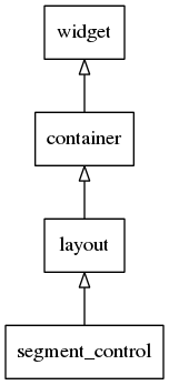
This widget inherits from the Layout one, so that all the functions acting on it also work for segment control objects.
This widget emits the following signals, besides the ones sent from Layout :
"changed"- When the user clicks on a segment item which is not previously selected and it gets selected. The event_info parameter is the segment item pointer.
Available styles for it:
"default"
The default content parts of the segment control items that you can use are:
- "icon" - An icon in a segment control item.
The default text parts of the segment control items that you can use are:
- "default" - Title label in a segment control item.
Supported common elm_object APIs.
- elm_object_disabled_set
- elm_object_disabled_get
Supported common elm_object_item APIs.