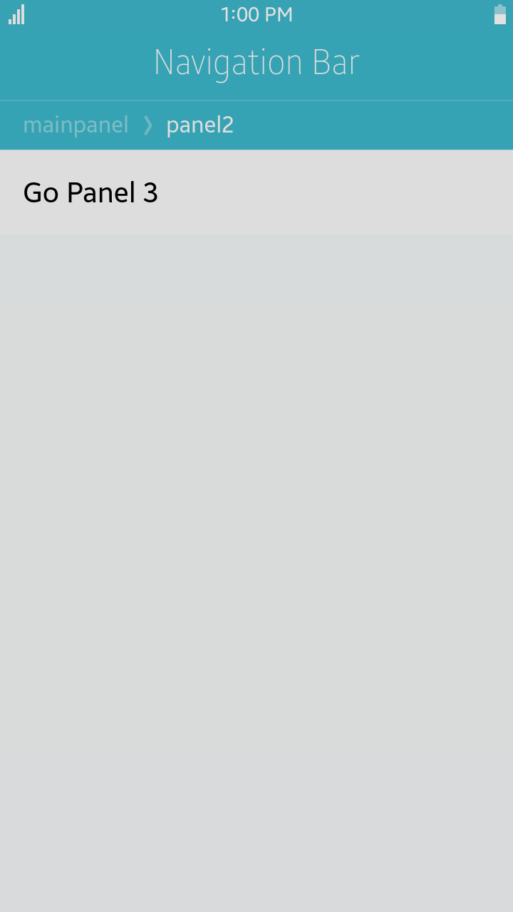
Panel Changer
To implement multi page layout in a page component, you can use panel and panel changer components.
Panel can have header, content and so on like the page component.
It works even if the panel components is in other HTML files.
Panel changer component controls lifecycle of the panels.

Table of Contents
Default Selectors
By default, all elements with the class="ui-panel-changer" or data-role="panel-changer" attribute are displayed as panel changer components.
Panel components use the class="ui-panel" or data-role="panel"
Manual Constructor
For manual creation of panel changer, you can use constructor from tau namespace:
var elPanelChanger = document.getElementById("panelchanger"),
    panelChanger = tau.widget.PanelChanger(elPanelChanger);
HTML Examples
-
Panels in another HTML file panel.html
<div id="panel2" class="ui-panel"> <div class="ui-content"> <ul class="ui-listview"> <li class="ui-li-anchor"> <a href="#panel3">Go Panel 3</a> </li> </ul> </div> </div> <div id="panel3" class="ui-panel"> <div class="ui-content"> <ul class="ui-listview"> <li class="ui-li-anchor"> <a>Panel3</a> </li> </ul> </div> </div> -
Panel changer and main panel in your HTML file
<div id="panelChanger" class="ui-panel-changer">
   <div id="mainpanel" class="ui-panel">
      <ul class="ui-listview">
         <li class="ui-li-anchor">
            <a href="./panel.html#panel2">Go Panel 2</a>
         </li>
      </ul>
   </div>
</div>
Options
| Option | Input type | Default value | Description |
|---|---|---|---|
| data-manage-history | boolean | true | represent whether to manage history of panels |
Events
| Name | Description |
|---|---|
| panelbeforecreate | Triggered before the new panel component is created and initialized. |
| panelcreate | Triggered after the new panel component creation. |
| panelbeforeshow | Triggered before the new panel is displayed. |
| panelshow | Triggered after the new panel is displayed. |
| panelbeforehide | Triggered before the current panel is about to be closed. |
| panelhide | Triggered after the current panel is hidden. |
| panelchange | Triggered after switching from the current panel to the new panel. |
Methods
Summary
| Method | Description |
|---|---|
changePanel(String address, String animationType, String direction) |
Change panel method |
changePanel-
change panel
changePanel(String address, String animationType, String direction)
Parameters:
Parameter Type Description address String path of a panel to be changed animationType String animation type of panel changing direction String represent panel history goes forward or backward. Return value:
No Return Value