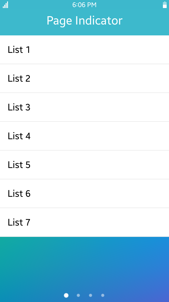
PageIndicator
PageIndicator component presents as a dot-typed indicator.
The highlighted dots represent the corresponing active pages.
According to option, the maximum number of dots and the number of pages to be linked can be set.
If the number of linked pages is more than dots which can be displayed, a central dot is assigned to multiple pages.
| Note |
|---|
| This component is supported since 2.4. |

Table of Contents
Default Selectors
By default, all elements with the class="ui-pageindicator" or data-role="page-indicator" attribute are displayed as page indicator components.
Manual Constructor
For manual creation of PageIndicator, you can use constructor from tau namespace:
var elPageIndicator = document.getElementById("pageIndicator"),
    pageIndicator = tau.widget.PageIndicator(elPageIndicator, {numberOfPages: 5});
Constructor has two require parameter element which are base HTMLElement to create component. We recommend get this element by method document.getElementById.
Second parameter is options and it is a object with options for component. numberOfPages means the number of pages to be linked and it is mandatory.
HTML Examples
-
To create page indicator
<div id="pageIndicator" class="ui-page-indicator" data-number-of-pages="5"></div>
data-number-of-page attribute is same as numberOfPages option in manual constructor description.
-
To use page indicator with section changer component
HTML code:
<div class="ui-content">
   <div class="ui-page-indicator" id="pageIndicator" data-number-of-pages="4" style="bottom: 0;"></div>
   <div id="hsectionchanger" class="ui-section-changer">
      <!--Section changer has only one child-->
      <div>
         <section class="ui-section-active">
            <ul class="ui-listview">
               <li class="ui-li-static">List</li>
            </ul>
         </section>
         <section>
            <ul class="ui-listview">
               <li class="ui-li-static">List</li>
            </ul>
         </section>
         <section>
            <ul class="ui-listview">
               <li class="ui-li-static">List</li>
            </ul>
         </section>
         <section>
            <ul class="ui-listview">
               <li class="ui-li-static">List</li>
            </ul>
         </section>
      </div>
   </div>
</div>
JS code:
var sectionChanger = document.getElementById("hsectionchanger"),
    elPageIndicator = document.getElementById("pageIndicator"),
    pageIndicator;
pageIndicator = tau.widget.PageIndicator(elPageIndicator);
sectionChanger.addEventListener("sectionchange", function(e)
{
   pageIndicator.setActive(e.detail.active);
}, false);
Options
| Option | Input type | Default value | Description |
|---|---|---|---|
| maxPage | number | 5 | the maximum number of pages(dots) which can be displayed on screen |
| numberOfPages | number | null | the number of pages to be linked (mandatory) |
Take an example : the situation that the value of data-number-of-pages is "5" (5 pages in all), and the value of data-max-page is "3" (3 dots).
<div id="pageIndicator" class="ui-page-indicator" data-number-of-pages="5" data-max-page="3"></div>
When you scroll the page (or section) horizontally, the number of exceeding pages (in this case, it is 2 pages, which is the result of 5 - 3)
would be indicated by the central dot, from middle of the pages.
So, the first dot is for the first page, and the last dot is for the fifth (the last) page.
And the middle dot is shared by 2nd, 3rd and 4th page while scrolling pages.
In the case of even value of data-max-page (the number of dots on the screen), the next order of half of the data-max-page value would work as middle dot.
For example, in the situation that the value of data-number-of-pages is "6", and the value of data-max-page is "4", the 3rd dot (the result of 4 / 2 + 1) would indicate 3rd, 4th and 5th pages as middle dot.
Of course, the value of data-number-of-pages should meet the number of the pages you have added to HTML.
And if the the value of data-max-page (dots) exceeds the value of data-number-of-pages, indicator dots will be displayed as the value of data-number-of-pages.
For example, in the situation that the value of numberOfPages is "6", and the value of maxPage is "100",there would be still 6 dots on the screen.
Methods
Summary
| Method | Description |
|---|---|
setActive(number index) |
This method sets a dot to active state. |
setActive-
This method sets a dot to active state.
setActive(number index)
Parameters:
Parameter Type Required / optional Default value Description index number required index which is active state. Return value:
No Return Value