Expandable
The Expandable component allows you to expand and collapse content when tapped.
| Note |
|---|
| This component is supported since Tizen 2.4. |
| It was renamed from Collapsible component of Tizen 2.3. |
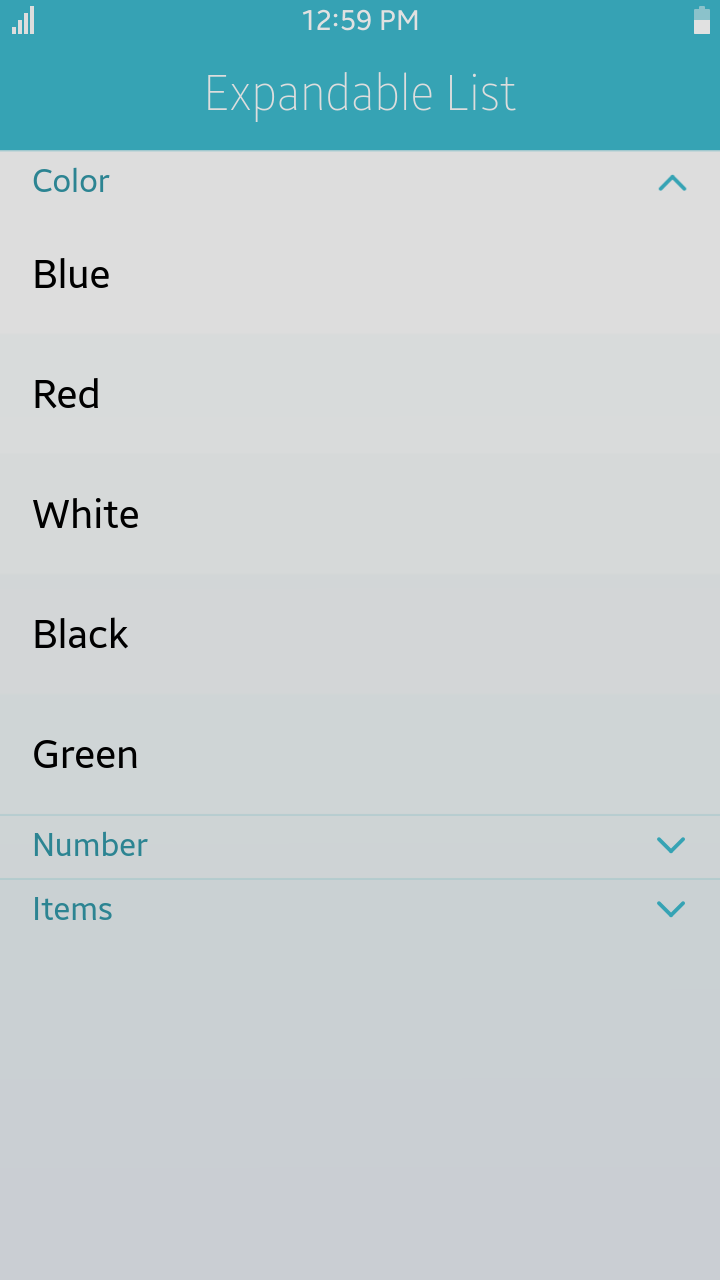
Table of Contents
Default Selectors
By default, all elements with the class="ui-expandable" or data-role="expandable" attribute are displayed as Expandable components.
Manual Constructor
To manually create a expandable component, use the component constructor from the tau namespace:
The constructor requires an HTMLElement parameter to create the component, and you can get it with the document.getElementById() method. The constructor can also take a second parameter, which is an object defining the configuration options for the component.
var expandableEl = document.getElementById("expandable"),
    expandableWidget = tau.widget.Expandable(expandableEl, {collapsed: false});
HTML Examples
-
To create a expandable
divelement using theclassattribute:<div id="expandable-test" class="ui-expandable" data-collapsed="false"> <h1>Expandable head</h1> <div>Content</div> </div>
-
To create a expandable list using the
classattribute:<ul class="ui-listview"> <li class="ui-expandable" data-collapsed="false"> <h2>Expandable head</h2> <!--Sub list in expandable li--> <ul class="ui-listview"> <li>sub list item1</li> <li>sub list item2</li> </ul> </li> <!--List item in 1st depth--> <li>other list item</li> <li>other list item</li> </ul>
Options
The options for a component can be defined as data-... attributes or passed as parameters to the constructor.
You can change an option for the component using the option method.
Summary
| Option | Input type | Default value | Description |
|---|---|---|---|
| data-collapsed | boolean | true | Sets whether the content must be collapsed on load. |
| data-heading | string | "h1,h2,h3,h4,h5,h6,legend,li" | Within the collapsible container, the first immediate child element. |
Methods
To call a method on the component, please refer following:
var expandableElement = document.getElementById("expandable"),
    expandableWidget = tau.widget.Expandable(expandableElement);

expandableWidget.methodName(methodArgument1, methodArgument2, ...);
Summary
| Method | Description |
|---|---|
Expandable disable() |
Disables the expandable component. |
Expandable enable() |
Enables the expandable component. |
disable-
Disables the expandable component.
Expandable disable()
The method sets the disabled attribute for the expandable component and adds classes related to the disabled state.
Return value:
Type Description Expandable Returns Expandable. Code example:
HTML code:
<div id="expandable" class="ui-expandable">
   <h6>Expandable head</h6>
   <div>Content</div>
</div>
JS code:
var expandableWidget = tau.widget.Expandable(document.getElementById("expandable")); expandableWidget.disable(); enable-
Enables the expandable component.
Expandable enable()
The method removes the disabled attribute from the expandable component and adds classes related to the enabled state.
Return value:
Type Description Expandable Returns Expandable. Code example:
HTML code:
<div id="expandable" class="ui-expandable">
   <h6>Expandable head</h6>
   <div>Content</div>
</div>
JS code:
var expandableWidget = tau.widget.Expandable(document.getElementById("expandable"));

expandableWidget.enable();